Most people are familar with bar charts. They show amounts for different categories.
The amounts will typically be either counts (frequencies) or percents.
We look at an example of both here.
Market Share
Suppose the following fashion stores having competing products with the following market shares:
| Pop Shop |
200000 |
| Tommy Go Figure |
100000 |
| Never 42 |
600000 |
| Country Infitters |
300000 |
Here is the barplot that goes with this:
Now suppose we want the percentage breakdown of these market shares:
\[
\frac{200000}{1200000} =
17\%
\]
\[
\frac{100000}{1200000} =
8\%
\]
\[
\frac{600000}{1200000} =
50\%
\]
\[
\frac{300000}{1200000} =
25\%
\]
So here is the market share by percentage:
| Pop Shop |
17 |
| Tommy Go Figure |
8 |
| Never 42 |
50 |
| Country Infitters |
25 |
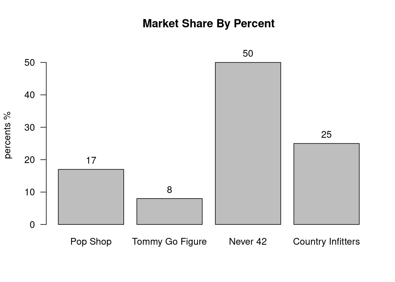
Now if we make a barplot with percentages this looks like this:
Example 10.1 (Market Share By Percent)
\[ \tag*{$\blacksquare$} \]
Of course the graph does not look any different, but it is nice to see the percentage breakdown in the chart easily.

